The public needs and deserves AQI simplification – why?
When I was teaching a digital electronics principles class at California State University, Long Beach during the 1987-’88 academic year, this is the class I liked the best – I taught three different electronics classes in all.
The students, besides being taught material that in comparison was like learning a whole new language, could, in lab, realize through electronic circuitry, so much of what was being covered in class. Circuits built included ring counters, shift registers, and more. And, it was all based off of what is referred to as a binary or two-state approach: ones and zeros. One equates to “on.” Zero equates to “off.” It is that simple.
Simple being the operative word here how nice it would be if the Air Quality Index was simplified. Quite!
As it stands, the AQI is multi-tiered, meaning that there are presently six different levels or tiers of air quality-related characteristics.
- 0-50 = good (green)
- 51-100 = moderate (yellow)
- 101-150 = unhealthy for sensitive individuals or groups (orange)
- 151-200 = unhealthy (red)
- 201-300 = very unhealthy (purple)
- 301 and above = hazardous (maroon)
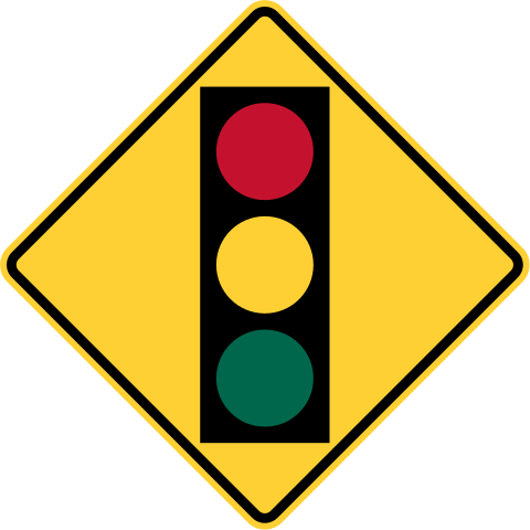
Believe it or not, but when I was in elementary school, in the cafeteria, attached to one of its eating-room walls was a wood board on which was affixed three light sockets. In each of the three sockets sat, respectively, three different colored light bulbs.
- Red
- Yellow
- Green
With at least one on at all times, when the green bulb was lit, talking was permitted. With the yellow bulb illuminated, this meant chatter had become too loud, the illuminated yellow lightbulb serving as kind of a warning to, as it were, tone things down. When the red bulb was lit, watch out, that meant talking was prohibited – no ifs, ands or buts about it. Was a disciplinary tool of this nature a bit too extreme? I don’t think so. But, that’s really beside the point. What matters here isn’t that this method’s approach to disciplining was extremely effective which, by the way, it was, but rather that this tool’s message was exceedingly clear. And all contained in a simple – 3-light – package and the real beauty of this whole thing.
As it relates to the Air Quality Index, why on earth is anything other than a two-color AQI reporting system needed? I mean, as in the binary system of ones and zeros alluded to above, the bottom line is that air quality is either healthy or it’s not. Therefore, as to why the need for each and all of the categories in-between, is simply beyond me.
If the categories were reduced to just two – healthy (green) and unhealthy (red) – would this not get across the condition or “quality” of outdoor or outside air? Of course, it would!
Besides, in the end, such should give the public a better understanding of – and maybe a greater appreciation for – how close or far areas that don’t meet air quality standards are to becoming standards compliant. As a point of reference, it should be noted the standards (ozone – O3 – and fine particulates – PM2.5) conform to air quality that is in a state of good (healthy) repair only. Exceed or breach the so-called “cut-off” point and whether O3 or PM2.5, the standard is unmet. It’s as simple and as complicated as that.
If it happens my argument fails to convince, then I defer to the KISS or Keep It Simple Silly principle.
So, who’s got comments, questions?
Image above: Wikimedia Commons
– Alan Kandel

Your explanation and recommendation make sense to this layman, Mr. Kandel.
Now I am wondering what the cut-off points for O3 and PM2.5 are, which should be easy to find.
Bingo!
More dumbing down of America. I want the actual number, not someone’s opinion if its healthy or not.
To your second point, I don’t disagree.
Air Quality Index implies a numbered and color-coded system with corresponding health explanation.
This is ridiculous. Who decides where the division between healthy and unhealthy comes? What we have now lets us think about what our own health is, and what kind of activities we can do without getting into trouble. A small child, an asthmatic, and a healthy 20 year old have different cut-off points for outdoor activities. If the unhealthy cutoff is too low for the latter, they’ll learn to ignore it. If it’s too high for the former, they’ll be doing things which are not safe for them.
I somewhat agree which means I also somewhat disagree.
Using ozone as an example, myriad experts contend that the national standard for ozone measured over a period of 8 hours (set at 70 parts per billion of air on Oct. 1, 2015) is still too unhealthful. Much of the scientific community agreed that the standard should be set at a much more health protective 60 parts per billion of air.
Using the 60 parts per billion of air threshold, following my suggestion, anything above this more health-protective 8-hour ozone level would be deemed unhealthy. By assigning, let’s say, a corresponding Air Quality Index level number of 51 (51 here being one number above the number 50 which would represent the upper limit of the good, healthy air (green) category and the cut-off I referred to in my opinion above), this way the much more health-protective threshold would no doubt take into consideration the full spectrum of health vulnerabilities. This way, as I see it, there would be no guesswork as to whether the air was safe, healthy to breathe or it wasn’t.
You may find the article “Horrendous air or no let the Friday night football games begin” to be of some help. Link here: https://alankandel.scienceblog.com/2014/11/08/horrendous-air-or-no-let-the-friday-night-football-games-begin/