Energy use or consumption in the United States, when you think about it, how many people give this any serious thought? It’s not conversation that typically comes up at dinner time.
But, this doesn’t mean the subject isn’t important. It’s good to take a look at American energy consumption from time to time just to know how the U.S. is doing energy consumption-wise and whether use of energy is rising, falling or remaining flat.
What’s happening and who’s saying what
To fulfill a requirement for Stanford University’s “Introduction to Nuclear Energy” (PH241) coursework, an assignment given students enrolled in said course during the Winter 2017 semester involved writing and submitting a paper (essay) related to nuclear energy.
One, “How Energy Use Might Look In The Future,” is by Mitchell Kogan.

The essay opens with the author positing that society has witnessed substantial changes in energy use and that these have occurred during the more recent past going several centuries back, while more recently, the U.S. contribution to the supply of global energy is nearly a fifth and that four-fifths of that is non-renewably derived, meaning fossil fuel supplies still dominate.1
The consumption distribution
So what’s been the trend in energy consumption in the U.S.?
To get answers, the U.S. Energy Information Administration’s Monthly Energy Review for Feb. 2019 was consulted. Looked at are years 1955, 1965, 1975, 1985, 1995, 2005, 2015, 2016 and 2017.2
The total energy consumed* for each of the years listed is as follows:
- 1955 – 40.208
- 1965 – 54.015
- 1975 – 71.965
- 1985 – 76.392
- 1995 – 90.991
- 2005 – 100.168
- 2015 – 97.484
- 2016 – 97.444
- 2017 – 97.807
*(Units of measure for all amounts above in quadrillion British Thermal Units or Btu)
Incidentally, the highest energy usage occurred in 2007 with total consumption of 100.971 quadrillion Btu.
The per-sector breakdown for year 20173 from most to least (in quadrillion Btu) is as follows:
- petroleum – 36.174
- natural gas – 28.034
- coal – 13.837
- renewable energy – 11.179
- nuclear electric power – 8.419
Meanwhile, within the renewable energy category4, the distribution (in quadrillion Btu) from most to least is thus:
- biomass – 5.084
- hydroelectric power – 2.767
- wind – 2.343
- solar – 0.774
- geothermal – 0.210
For a point of reference, energy consumption from renewable sources in 1950 was 2.978 quadrillion Btu while total consumption for that year was 34.616 quadrillion Btu. As expected, data for geothermal, solar and wind was unavailable.
Connection to carbon
These days, a concern of people is knowing what one’s carbon footprint is. Air pollution being another, many will want to know how energy consumption and carbon output correlate.
To see what exactly this relationship is, “Table 12.6 Carbon Dioxide Emissions From Energy Consumption: Electric Power Sector”5 in the same Monthly Energy Review was consulted.
Table 12.6 begins with the year 1973. Years 1975, 1985, 1995, 2005, 2015, 2016 and 2017 are looked at. Total carbon dioxide emissions output per each year considered, is given. Units are in Million Metric Tons of Carbon Dioxide or MMTCO2.
- 1975 – 1,244
- 1985 – 1,619
- 1995 – 1,960
- 2005 – 2,416
- 2015 – 1,913
- 2016 – 1,821
- 2017 – 1,743
Notice that from the list above, carbon dioxide emissions output was at its highest level in 2005 – 2,416 MMTCO2. It is also worth noting that after reaching a high of 2,425 MMTCO2 in 2007, generally speaking, carbon dioxide emissions from electric power consumption have been decreasing.
Still within the “Environment” section (Section 12) and immediately following the different (carbon dioxide emissions) tables (Tables 12.1 to 12.7), there is page space on which both “Notes” and “Methodology and Sources” information is provided.
And, under what is referred to as “Note 1. Emissions of Carbon Dioxide and Other Greenhouse Gases,” there is explanation related to carbon dioxide emissions. Here is an excerpt:

“Energy-related carbon dioxide emissions account for about 98% of U.S. CO2 emissions. The vast majority of CO2 emissions come from fossil fuel combustion, with smaller amounts from the non-combustion use of fossil fuels, as well as from electricity generation using geothermal energy and non-biomass waste. Other sources of CO2 emissions include industrial processes, such as cement and limestone production.”6
The Feb. 2019 Monthly Energy Review from the U.S. Energy Information Administration can be accessed here.
Also see: “Domestic Transport Energy 1975-2015: What the data suggest” here.
Notes
- Kogan, Mitchell, “How Energy Use Might Look In The Future,” Stanford University “Introduction to Nuclear Energy” (PH241) winter 2017 semester paper
- Monthly Energy Review, “Table 1.3 Primary Energy Consumption by Source,” U.S. Energy Information Administration, Feb. 2019, p. 7. DOE/EIA-0035(2019/2)
- Ibid
- Ibid
- Ibid, “Table 12.6 Carbon Dioxide Emissions From Energy Consumption: Electric Power Sector,” p. 209
- Ibid, “Environment,” p. 211
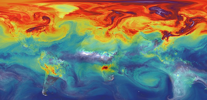
Image (lower): NASA/GSFC
This post was last revised on Dec. 21, 2020 @ 1:54 p.m. Pacific Standard Time.
Published by Alan Kandel